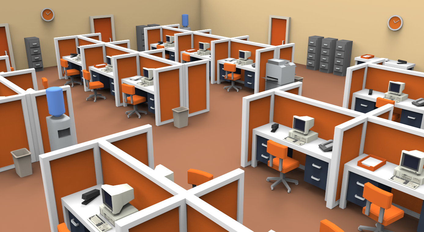
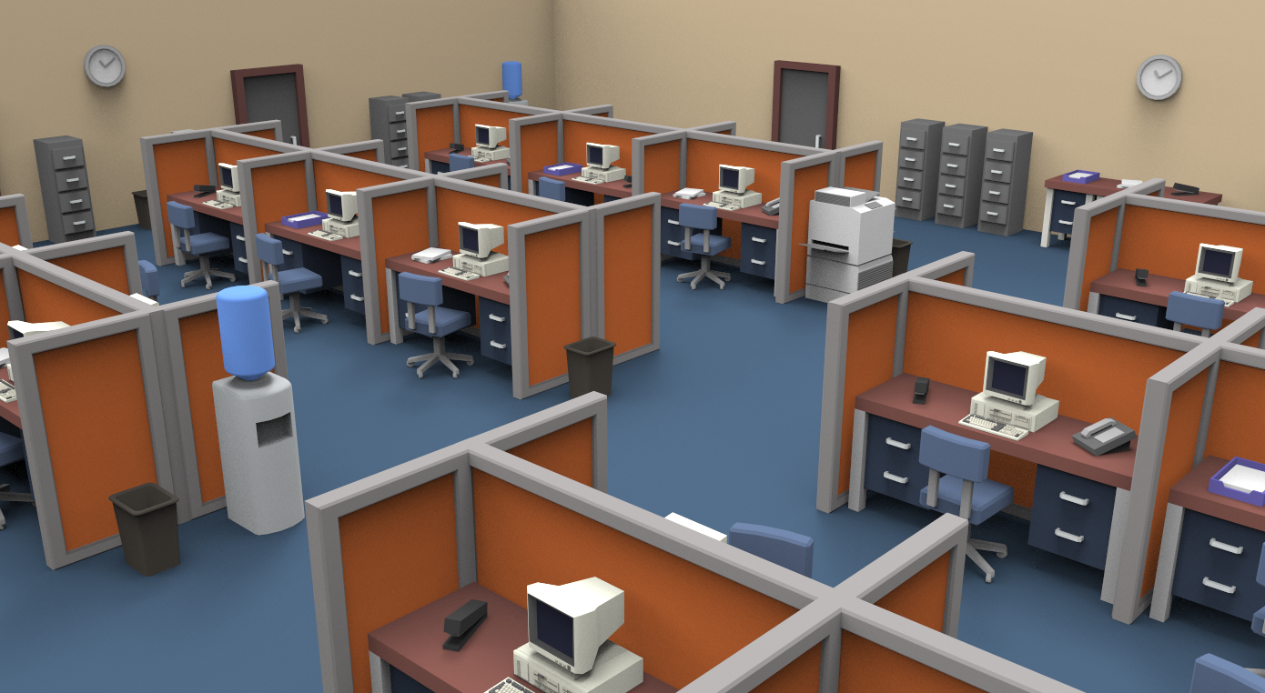
After the exploration with color, the decision has become fairly clear. As a group, we ran through each of the color concepts and sorted out the pros and cons. As expected, there were a couple that were just way to exaggerated for our needs. That being said, they were definitely very useful. A lot of the color choice came down to taking the pro's of each concept, and trying to find a way to incorporate it in the final colors. A big example of this would be with the original superhot style render. Though this was very clearly not the direction we would like to go, the render still did a very good job at highlighting the intractable objects. Highlighting these objects with in the color palette seemed to be the biggest piece of feedback we got. The very vibrant render was also a popular one. The vibrancy of the render really played off of the comic nature of the game. That being said, I do believe that it was arguably to vibrant. With the colors, I want the game to get that comic/chaotic feel, while maintaining the believably, and approachable aspect of some of the other concepts. That being said, these two concepts became our biggest inputs when selecting the final concept.
In order to refrain from getting hung up on the colors, this color decision needed to be finalized and quick. For the final color selection, I did my best to grab from both the superhot, and vibrant color pallets (from the previous blog post) while making the game approachable and readable. In the final color selection, I focused on maintaining the readability of intractable objects, while bringing in some splashes of color from the vibrant render. This entire process has been a fairly educational one. Having learned color theory in some of my previous classes, it was very interesting to put that knowledge to good use.
-Will